The Creative Direction
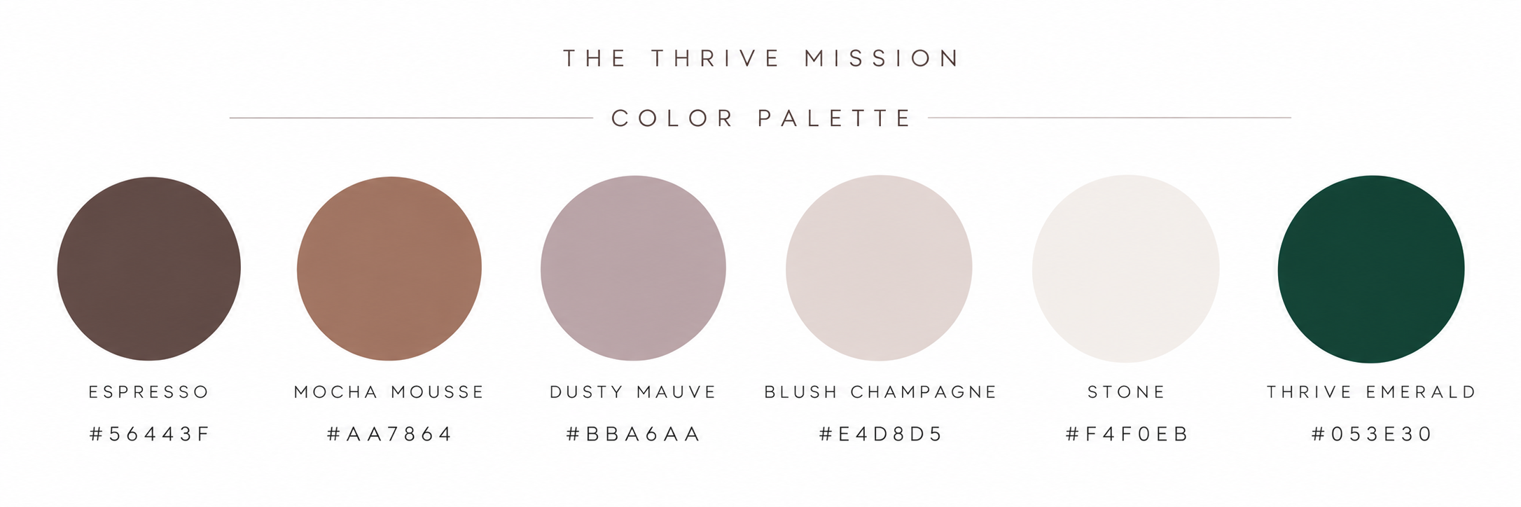
Softness meets strength in a thoughtfully curated palette of earthy neutrals, dusty mauve, warm espresso, and deep emerald.
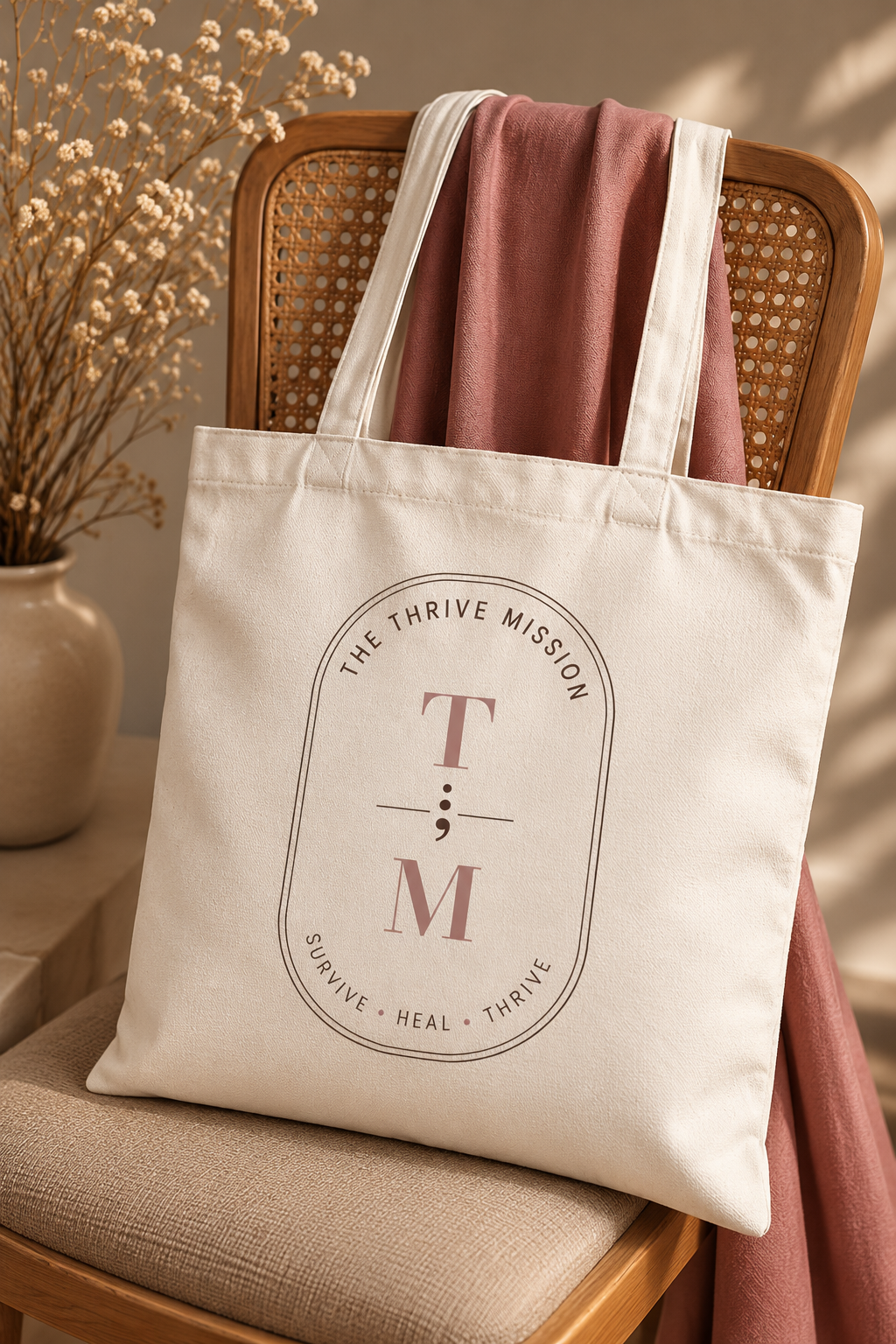
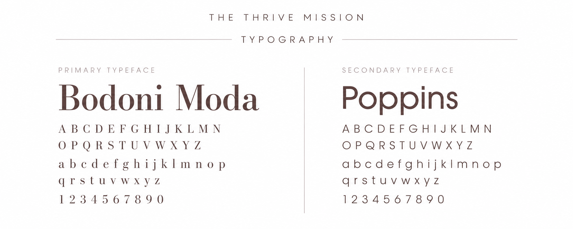
Elegant Bodoni Moda typography brings sophistication, while modern Poppins creates balance and approachability. At the heart of the identity is a distinctive semicolon-inspired mark, symbolizing continuation, resilience, and the beauty of a story still being written.
Every detail was designed to communicate one feeling: You are seen. You are supported. You can thrive.
A Visual Identity Rooted in Resilience
The Thrive Mission is a purpose-driven brand centered on healing, empowerment, and personal transformation.
The creative vision was to develop an identity that felt both nurturing and powerful—a visual representation of the journey from surviving to truly thriving.
The Final Identity
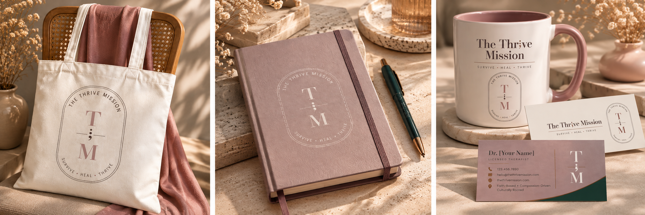
A cohesive and versatile brand system featuring a signature wordmark, meaningful iconography, complementary typography, and a calming color palette.
From stationery to lifestyle applications, the identity creates a recognizable visual presence that feels intentional, restorative, and timeless.
SERVICES PROVIDED
Brand Identity Design · Logo Design · Color Palette Development · Typography · Brand Guidelines